List Map

Used to add a Google map to your page. This shortcode allows you to add post lists to your map. If the post has an address or latitude and longitude field, you can select it from within the shortcode and include the post on the map. There are a number of templates to choose from for the list (if you want to show the list).
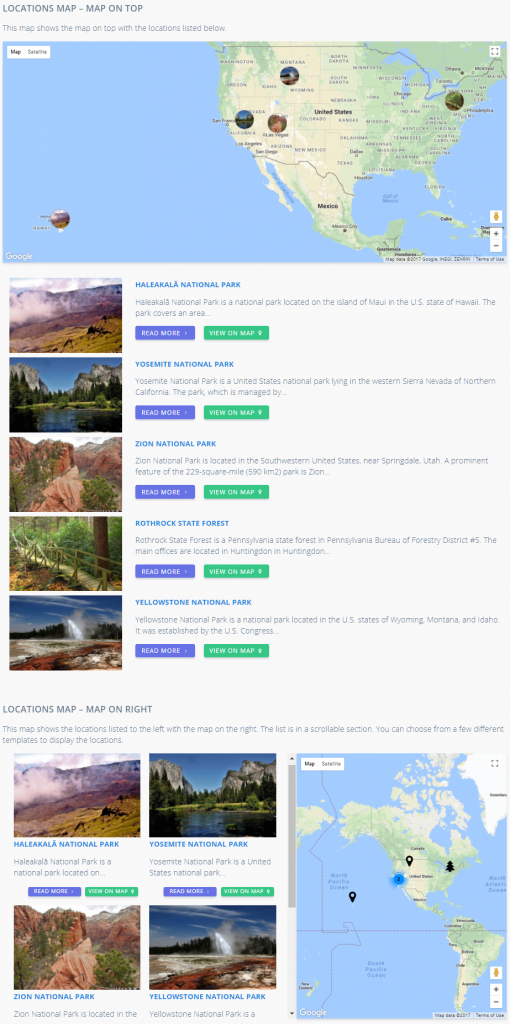
List Map Shortcode - General tab
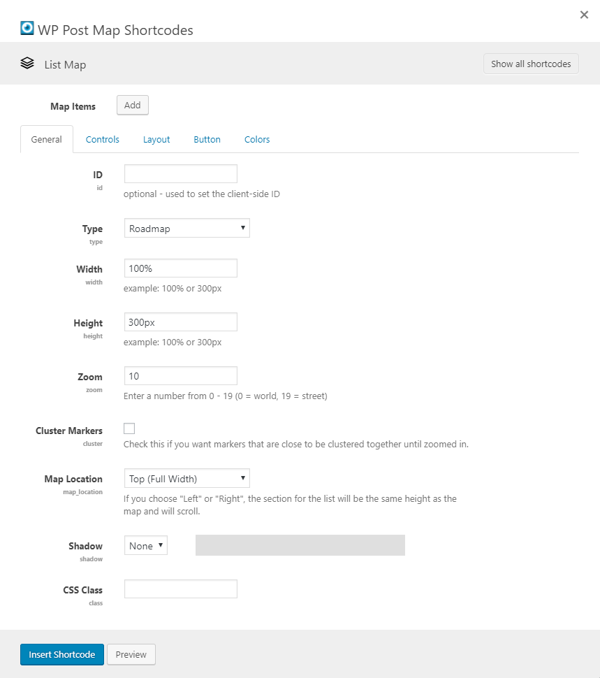
The options on the General tab allow you to set a number of standard settings for the map.

General tab settings

ID
This allows you to add an ID to the map, which sets the client-side ID.
Type
Select the type of map you want to show.
Width
Set the width of the map. The default is 100%.
Height
Set the height of the map. Default is 300px (examples: 100% or 300px).
Zoom
Set the initial zoom level for the map. Enter a number between 0 and 19 (0 = world, 19 = street). Default is 10.
Cluster Markers
Check this if you want markers that are close to be clustered together until zoomed in.
Map Location
This will be the location of the map. If you choose "Left" or "Right", the section for the list will be the same height as the map and will scroll. The list will be hidden for smaller devices, showing just the map.
Shadow
This options allows you to select a shadow to show on the map itself. When a shadow is selected, you'll see a preview of the shadow to the right of the select box.
CSS Class
This allows you to add a CSS class to the map. Adding a CSS class might help you to style certain things.

List Map Shortcode - Controls tab

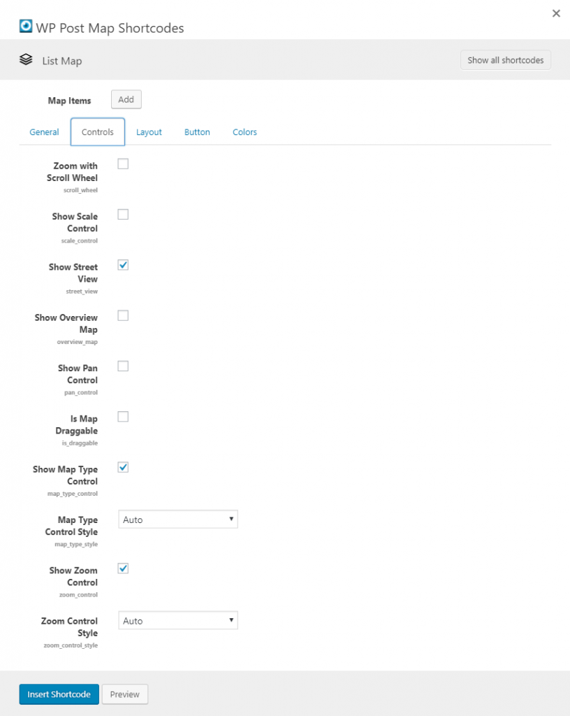
The options on the Controls tab allow you to setup how the map works and what shows on the map.

Controls tab settings

Zoom with Scroll Wheel
If this option is checked, when you hover over the map, you'll be able to use the scroll wheel on the mouse to zoom the map.
Show Scale Control
If this option is checked, the scale control option will show on the map.
Show Street View
If this option is checked, the street view control will show on the map (where it is available).
Show Overview Map
If this option is checked, the overview map will show on the map. This is a smaller map version.
Show Pan Control
If this option is checked, the pan control option will show on the map.
Is Map Draggable
If this option is checked, you will be able to click and hold down the mouse button to pan around on the map.
Show Map Type Control
If this option is checked, you'll have an way to control the type of the map. With this, you'll be able to control if the map is showing a road map, satellite, or hybrid view.
Map Type Control Style
Select the style of the Map Type Control. The default is "Auto".
Show Zoom Control
If this option is checked, the zoom control option will show on the map.
Zoom Control style
Select the style of the Zoom Control. The default is "Auto".

List Map Shortcode - Layout tab

The options on the Layout tab allow you to setup how the list will show, if in fact you want a list to show. You can also select the template to be used for the InfoWindow on the map.
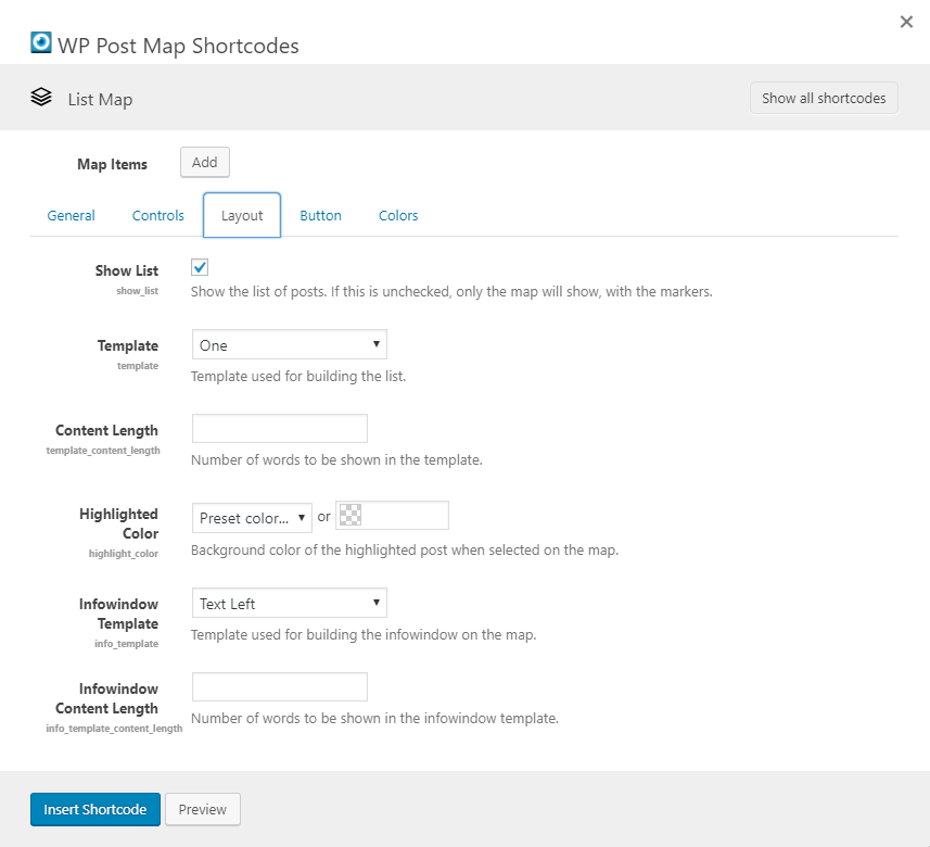
Layout tab settings

Show List
Check this option if you want to show the list of posts. If this is unchecked, only the map will show, with the markers.
Template
Template used for building the list. This allows you to show the posts in a different layout.
Content Length
Number of words to be shown in the template. This allows you to control how much text is shown. You may want more text to be shown for one template as opposed to another.
Highlighted Color
Background color of the highlighted post when selected on the map. If you click the marker on the map or the map button in the list, the background color of the list item will be highlighted with this color.
Infowindow Template
Template used for building the infowindow on the map (when a marker is clicked).
Infowindow Content Length
Number of words to be shown in the infowindow template. This allows you to control how much text is shown.

List Map Shortcode - Button tab

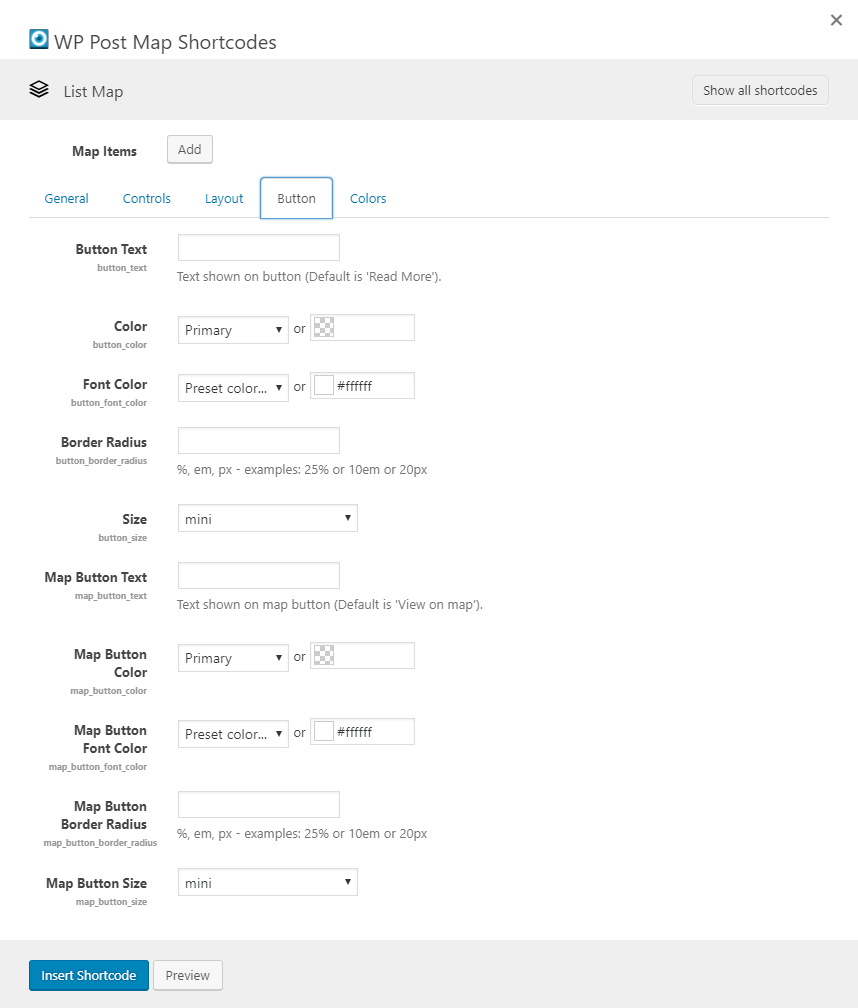
The options on the Layout tab allow you to setup how the list will show, if in fact you want a list to show. You can also select the template to be used for the InfoWindow on the map.

Button tab settings

Button Text
Set the text for the button in the list that links to the post. Default is "Read More".
Color
Set the color for the button in the list that links to the post. Default is "Primary", which can be changed in the WP Post Map settings.
Font Color
Set the font color for the button in the list that links to the post. Default is white.
Border Radius
Set the border radius for the button in the list that links to the post. By default, there is no border radius, so the button has square corners.
Size
Select the size that you want to use for the button. Each increase in size gives a little more padding around the text. The default size is "mini".
Map Button Text
Set the text for the button in the list that links to the map, and opens the map marker infowindow. Default is "Read More".
Map Button Color
Set the color for the button in the list that links to the map, and opens the map marker infowindow. Default is "Primary", which can be changed in the WP Post Map settings.
Map Button Font Color
Set the font color for the button in the list that links to the map, and opens the map marker infowindow. Default is white.
Map Button Border Radius
Set the border radius for the button in the list that links to the map, and opens the map marker infowindow. By default, there is no border radius, so the button has square corners.
Map Button Size
Select the size that you want to use for the button. Each increase in size gives a little more padding around the text. The default size is "mini".

List Map Shortcode - Colors tab

The options on the Colors tab allow you to set the colors of the map. If you have questions about color options, please check out this link. You can learn how to use the options and see the changes without saving and refreshing. The screen is a little confusing, but making changes to hue, saturation, lightness, gamma and invert lightness will get you going in the right direction. You can then take those values and plug them into the map options.
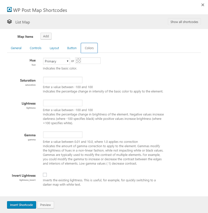
Colors tab settings

Hue
This is the basic color for the map.
Saturation
Enter a value between -100 and 100
Indicates the percentage change in intensity of the basic color to apply to the element.
Lightness
Enter a value between -100 and 100
Indicates the percentage change in brightness of the element. Negative values increase darkness (where -100 specifies black) while positive values increase brightness (where +100 specifies white).
Gamma
Enter a value between 0.01 and 10.0, where 1.0 applies no correction
Indicates the amount of gamma correction to apply to the element. Gammas modify the lightness of hues in a non-linear fashion, while not impacting white or black values. Gammas are typically used to modify the contrast of multiple elements. For example, you could modify the gamma to increase or decrease the contrast between the edges and interiors of elements. Low gamma values ( 1) decrease contrast.
Invert Lightness
Inverts the existing lightness. This is useful, for example, for quickly switching to a darker map with white text.

List Map Item Shortcode - General tab

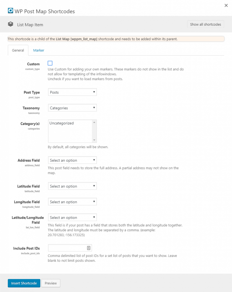
The options in this section are for the Markers.

General Tab Settings

Address
Set the address for the marker.
Latitude
Set the latitude for the marker. If you have set the address, this is not necessary.
Longitude
Set the longitude for the marker. If you have set the address, this is not necessary.
Title
This option sets the title for the marker, which will show in the infowindow.
Description
This option sets the description for the marker, which will show in the infowindow.
Post Type
Select the post type that you want to use to build the list for the map.
Taxonomy
Select the taxonomy if you want to limit the posts. As an example, you may only want to show posts that are from a particular category. Once a taxonomy is selected, the Category field will be filled below.
Category(s)
Select the categories that you want to show. To select multiples, hold down the 'Ctrl' key while you click the items.
Address Field
Choose the field for the post type that holds the address. This needs to be a full address.
Latitude Field
Choose the field for the post type that holds the latitude. This should be just the latitude.
Longitude Field
Choose the field for the post type that holds the longitude. This should be just the longitude.
Latitude/Longitude Field
Choose the field for the post type that holds the latitude and longitude. This field is if your post has a field that stores both the latitude and longitude together. The latitude and longitude must be separated by a comma. (example: 20.701283,-156.173325)
Include Post IDs
Comma delimited list of post IDs for a set list of posts that you want to show. Leave blank to not limit posts shown.

List Map Item Shortcode - Marker tab

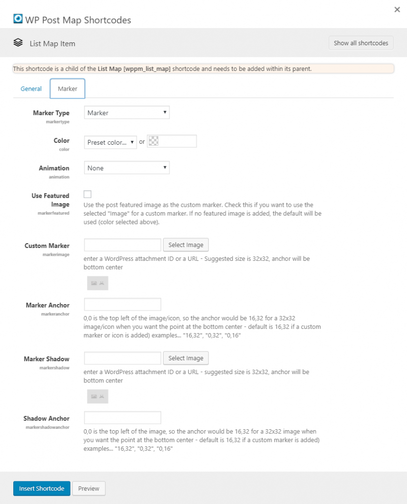
The options in this section are for the Markers. Select the type of marker that is going to be used.

Marker Tab Settings

Marker Type
Select the type of marker that you want to use for the Start Address.
Color
Select the color that you want to use for the marker.
Animation
Select an animation for the marker.
Use Featured Image
Use the post featured image as the custom marker. Check this if you want to use the selected "Image" for a custom marker. If no featured image is added, the default will be used (color selected above).
Icon Source
Select an Icon Source. This option is only visible if you select "Icon" from the "Marker Type" dropdown.
Icon
Select an Icon from this list, after you've selected an Icon Source. This option is only visible if you select "Icon" from the "Marker Type" dropdown.
Height
Set an icon height. This option is only visible if you select "Icon" from the "Marker Type" dropdown.
Width
Set an icon width. This option is only visible if you select "Icon" from the "Marker Type" dropdown.
Text
Set the text to show in the marker bubble. This option is only visible if you select "Bubble" from the "Marker Type" dropdown.
Custom Marker
Set a custom marker image to be used for the Start Address.
Enter a WordPress attachment ID or a URL - Suggested size is 32x32, anchor will be bottom center.
Marker Anchor
Set a marker anchor to be used for the Start Address.
0,0 is the top left of the image/icon, so the anchor would be 16,32 for a 32x32 image/icon when you want the point at the bottom center - default is 16,32 if a custom marker or icon is added) examples... "16,32", "0,32", "0,16"
Marker Shadow
Set a custom marker image to be used for the Start Address.
Enter a WordPress attachment ID or a URL - Suggested size is 32x32, anchor will be bottom center.
Shadow Anchor
Set a marker anchor to be used for the Start Address.
0,0 is the top left of the image/icon, so the anchor would be 16,32 for a 32x32 image/icon when you want the point at the bottom center - default is 16,32 if a custom marker or icon is added) examples... "16,32", "0,32", "0,16"